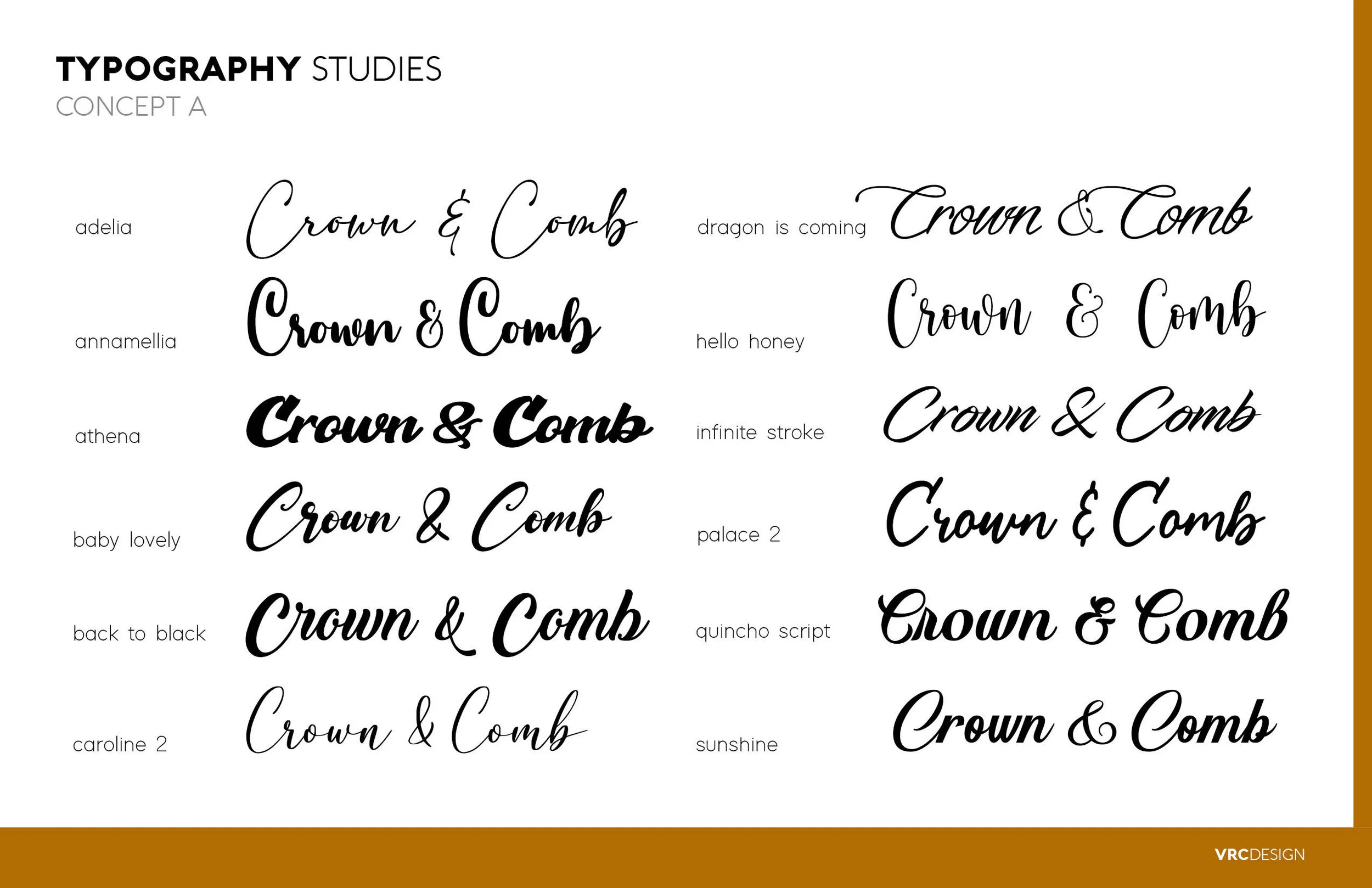
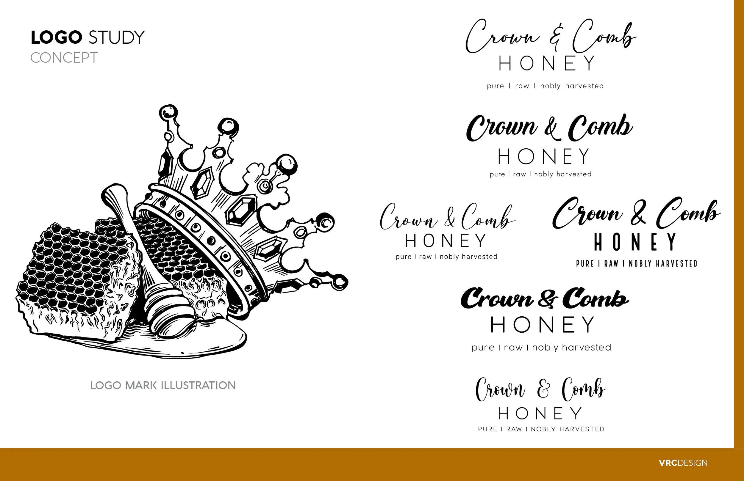


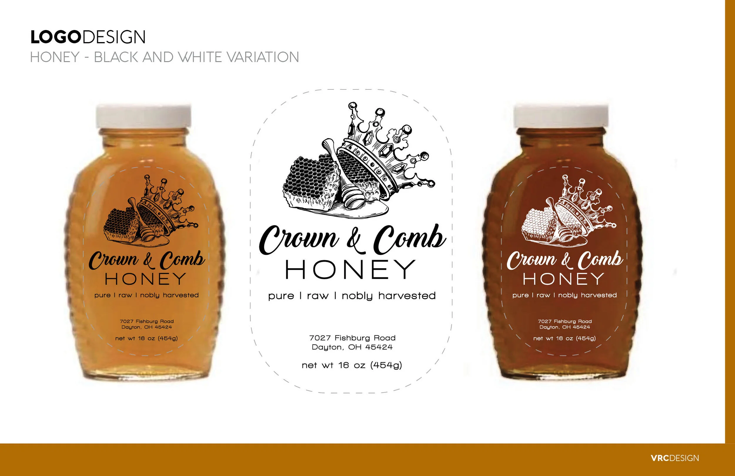


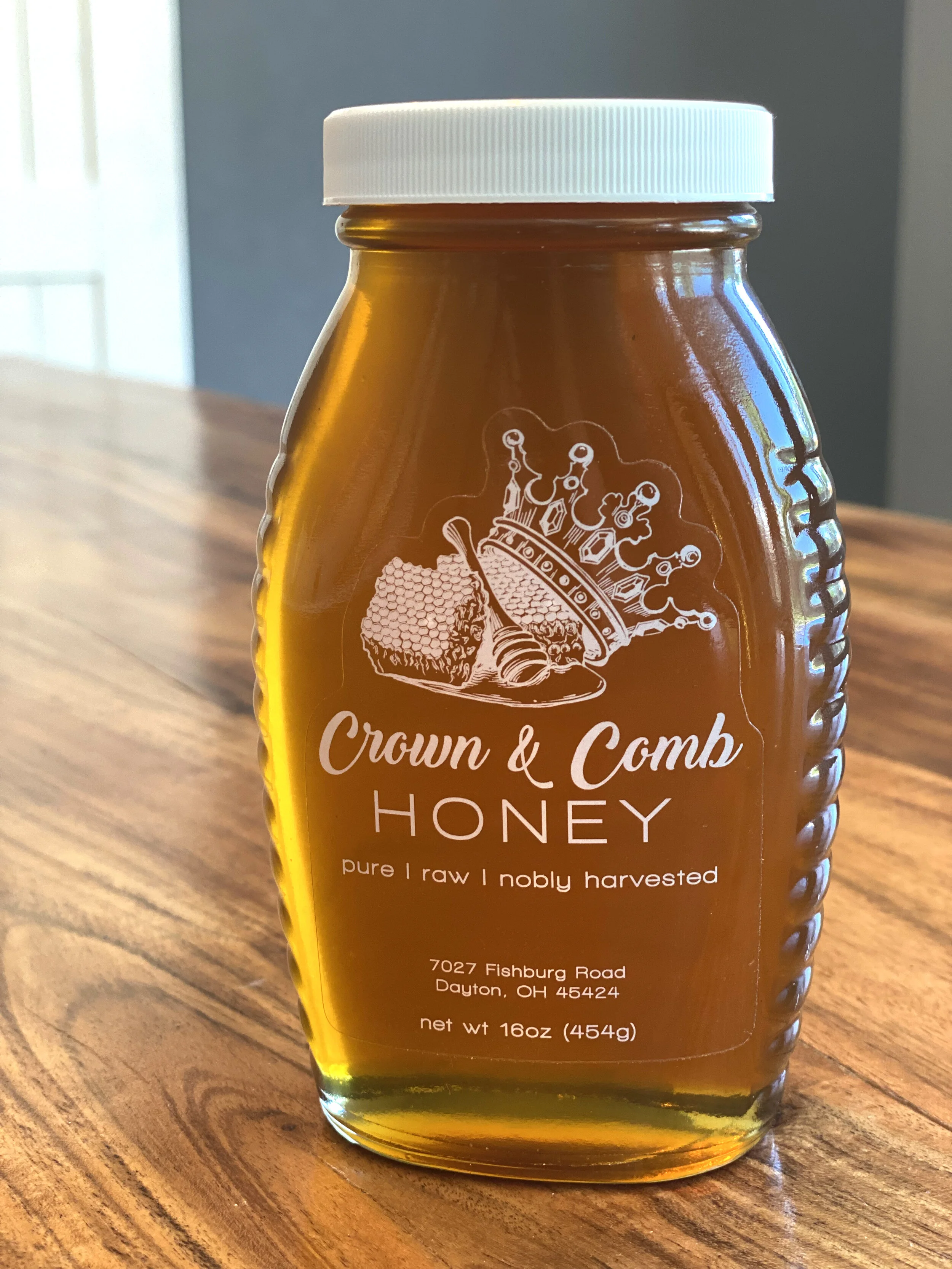

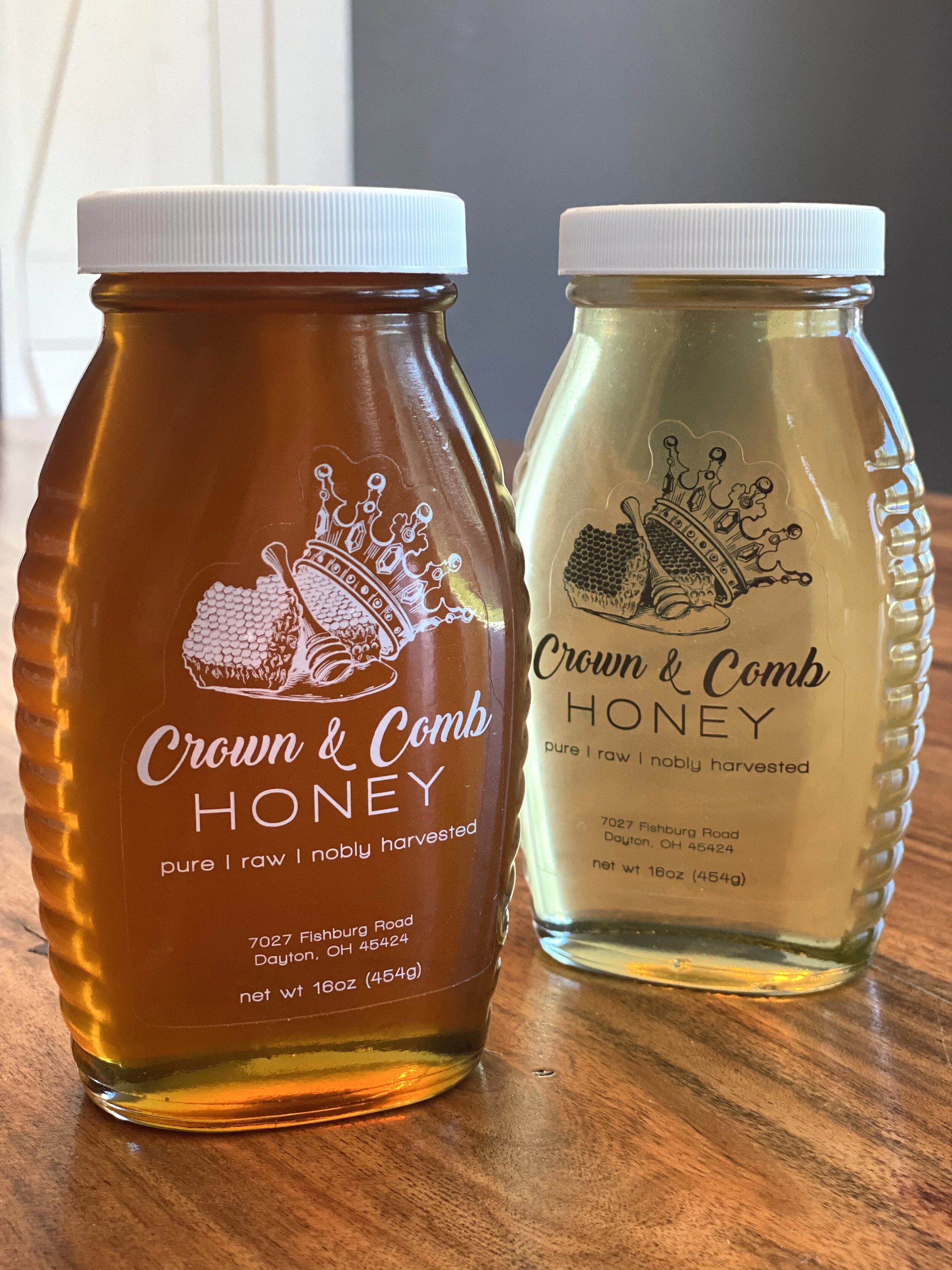
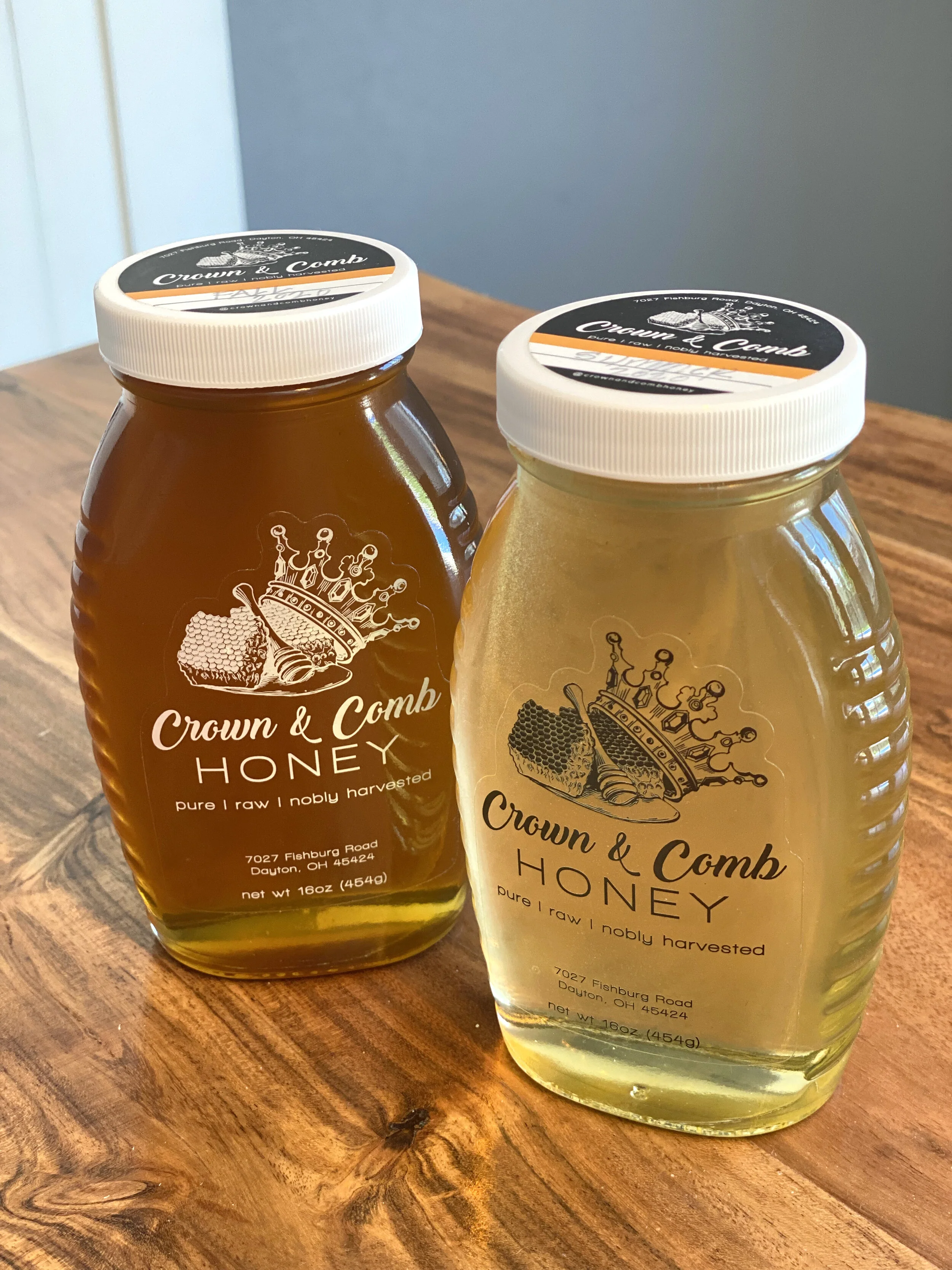
This brand identity was created to elevate a local bee-keeper’s honey business that is getting off the ground. The client came to me with an initial idea of the name and a more hand illustrated look for the image. I sketched the logo image digitally and then played with different typography to match the royalty of the name. Different labels were developed in order to be able to scale the brand onto several types of jars, containers and product variations produced from the bees.